
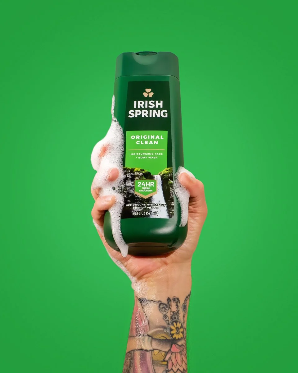
I love a clean, minimal shot as much as the next guy (probably more!) but that doesn’t mean sterile. It doesn’t mean lifeless. It doesn’t mean “safe.” And it definitely doesn’t mean forgettable.
A lot of brands here “clean” or “minimal” and think: plain white background, centered, call it a day. But minimalism doesn’t mean “do less.” It means DO IT ON PURPOSE.
Product photography needs to stop the scroll, build trust, and convert. But you don’t need clutter to communicate flavor, and you don’t need chaos to feel bold.
WHAT YOU NEED IS:
• clear focal points
• purposeful styling
• negative space that feels confident
• colors that support, not distract
•shadows that add drama, not clutter
When it’s done right a clean image hits harder than a chaotic one. It feels confident, elevated, memorable. The most effective product photos don’t have to scream (unless that’s your vibe - hey, you do you!) They just have to resonate.
MINIMAL DOESN’T MEAN MINIMAL EFFORT.
If your brand’s going for clean, reach out. I can help you make sure it still has something to say.
ENGAGING IMAGES FOR PRODUCT-BASED BRANDS